محتوای الکترونیکی
Process Diagram Sample

Write at least 150 words.
Report Plan
Paraphrase: shows>are depicting; average consumption of food in the world>the consumption of four food types across the globe
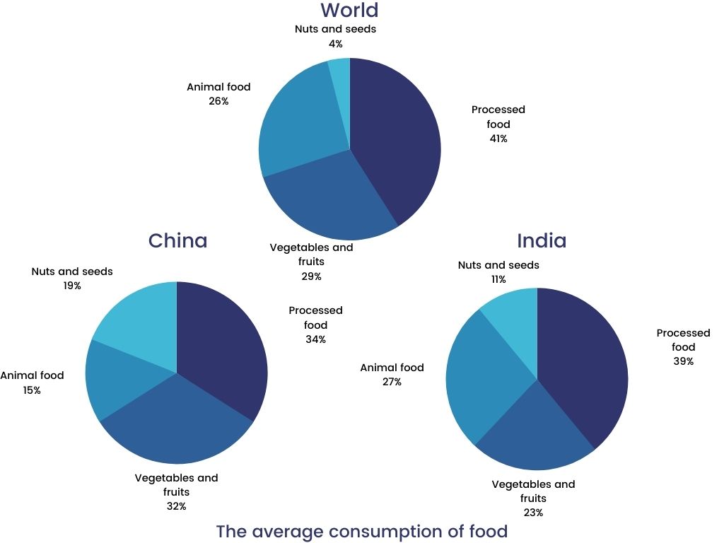
Overview: The graphs illustrate the consumption of 4 types of food used in the world in 2008.
Paragraph 2: (1) Give an overview of the two nations’ food consumption habits.
Paragraph 3: (1) Talk about the food consumption in the world. Give figures.
Paragraph 4: (1) Compare the food consumption of China. Give figures.
Paragraph 5: (1) Compare the food consumption of India. Give figures.
Sample Answer
The pie charts are depicting the consumption of four food types across the globe in 2008. The figures show a comparison of the amounts of food used in China and India in the same year.
Overall, the two nations presented dissimilar patterns of food consumption as compared to the average of the world. Out of all, processed food consumption had the largest shares of percentages in all the three charts.
Particularly, the consumption of processed food was the highest in the world, accounting for 41%, followed by vegetables and fruits at 29% and animal food at a quarter. The consumption of nuts and seeds only consisted 4%.
Similarly, China consumed 39% of the processed food, making it the one with the largest proportion. Animal food exhibited an identical figure, which is similar to the world’s average of 25%. Vegetables and fruits were used at 23%, while nuts and seeds showed less than a half figure.
In India, both vegetable and processed food were used the most in 2008 with 34% and 32% respectively. Nuts and seeds used in this country showed the largest proportion among the three given charts, making up 19%.
1 نظر
The provided pie charts make a comparison among different types of food used by India, china and the average of the world consumption. Overall, process food mad up the bulk of the tree charts in 2008. The figure for process food in India was approximately identical to that with world consumption at about 40%, while this percentage for China came in at one third of the whole. Vegetables and fruits had the most consumption in China with 33%, whereas that for two others chart constituted between one-fifth and one-fourth of the whole. The amount of foods associated with animals accounted for slightly more than 25% for India and average world's consumption, simultaneously respective proportion with China made up for two third of cited percentage. Surprisingly, the consumption of nuts and seeds in China and India were, respectively three and four times as high as that for average world's consumption.
لطفا وارد شوید و نظر خود را ثبت نمایید.
بهترین ها
| نام | تعداد آزمون | میزان موفقیت | |
|---|---|---|---|
| َAmeneh Darvishzadeh | 1 | 100/00 % | |
| Mehrad Hashemi | 1 | 100/00 % | |
| مهدی حسین پور آقائی | 1 | 100/00 % | |
| Farnoush Toghiany | 21 | 98/36 % | |
| zahra namdari | 46 | 98/21 % | |
| یاسمن محمدی پور | 4 | 98/08 % | |
| Sheida Taheri | 3 | 97/37 % | |
| پژمان همدانی | 3 | 97/37 % | |
| محمدحسین میرزایی | 3 | 97/30 % | |
| Tara Mohammadi | 3 | 96/43 % | |
| yasaman mohamadipur | 51 | 95/86 % | |
| محمدجواد ملائی اردستانی | 3 | 94/44 % | |
| Arzhang Saberi | 4 | 93/33 % | |
| Soheila Karimi | 124 | 92/73 % | |
| aram farhmand | 10 | 92/31 % | |
| یاشار اسکندری | 98 | 91/14 % | |
| الشان مقیمی آذر | 11 | 90/80 % | |
| عباس پورمیدانی | 1 | 90/00 % | |
| پریسا سلوکی شهرضایی | 72 | 89/49 % | |
| ارشیا قلمکاری | 33 | 89/23 % |