محتوای الکترونیکی
Pie Chart Sample

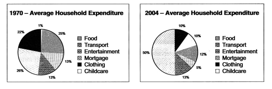
The pie charts below give information about the household expenditure of an average US family in different years.
Summarise the information by selecting and reporting the main features, and make comparisons where relevant.
Sample Answer
The pie charts compare the expenses of an average American household in 1970 and 2004. The most significant change that can be seen was in the proportion that went towards paying the mortgage, and the other increase was in the outlay for childcare.
Vocabulary
- The pie charts compare
- The most significant change that can be seen
- Went towards
- About a quarter of
- Doubled to
- Halved from
- Consumed more of the budget
9 نظر
the presented diagram compare cost of medial American families living, in two different years, 1970 and 2004.
The given pie chart shows the comparison of the cost of living in an average family over a period of time 1970 to 2004 .
Overall, while the major proportion in household expenditure of an average U.S family in 1970 and 2004 belongs to mortgage, the least percentage of household expenditure belongs to childcare in 1970 and mortgage in 2004.
the most significant change we can see is a dramatic increasing in mortgage and childcare. in addition there is remarkable declining in food and clothing.
supplied pie chart shows the comparison of the cost of Amereican families living,in period of time between 1970 to 2004.
The supplied pie charts provide the comparison of family costs in USA between two different years .
the sown pie chart figures the amount of the expenses of an average American household in 1970 and 2004.
The given charts demonstrate data on the expenses of an average American household between 1970 and 2004. Overall, that is clear that mortgage was responsible for the highest proportion of spending money in the USA, while the lowest one was entertainment. At one glance, during the time period, the percentage of transport leveled off. Talking about in detail, over the period the figure for mortgage turned twice, increasing from 26% to exactly a half. In addition, a dramatic jump in the proportion of salary spent on childcare can be observed, up to one in tenth. However, with a striking upsurge in childcare, the percentage of clothing plunged to just under half. Turning to the rest of the graphs, over the past 34 years, the average household expenditure on food dropped significantly and accounted for 12%. the proportion of the money spent on entertainment considerably decreased by 6% Over the time period.
the supplied pie charts demonstrate the comparison of the cost of living in an average family during a period of time 1970 to 2004
لطفا وارد شوید و نظر خود را ثبت نمایید.
بهترین ها
| نام | تعداد آزمون | میزان موفقیت | |
|---|---|---|---|
| َAmeneh Darvishzadeh | 1 | 100/00 % | |
| Mehrad Hashemi | 1 | 100/00 % | |
| مهدی حسین پور آقائی | 1 | 100/00 % | |
| Farnoush Toghiany | 21 | 98/36 % | |
| zahra namdari | 46 | 98/21 % | |
| یاسمن محمدی پور | 4 | 98/08 % | |
| Sheida Taheri | 3 | 97/37 % | |
| پژمان همدانی | 3 | 97/37 % | |
| محمدحسین میرزایی | 3 | 97/30 % | |
| Tara Mohammadi | 3 | 96/43 % | |
| yasaman mohamadipur | 51 | 95/86 % | |
| محمدجواد ملائی اردستانی | 3 | 94/44 % | |
| Arzhang Saberi | 4 | 93/33 % | |
| Soheila Karimi | 124 | 92/73 % | |
| aram farhmand | 10 | 92/31 % | |
| یاشار اسکندری | 98 | 91/14 % | |
| الشان مقیمی آذر | 11 | 90/80 % | |
| عباس پورمیدانی | 1 | 90/00 % | |
| پریسا سلوکی شهرضایی | 72 | 89/49 % | |
| ارشیا قلمکاری | 33 | 89/23 % |