محتوای الکترونیکی
Pie Chart Sample
Write at least 150 words.
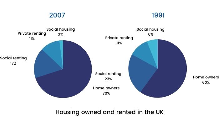
Housing owned and rented in the UK
Report Plan
Paraphrase: show>illustrate; the percentage of housing owned and rented in the UK>the comparability of homeownership and renting in the UK
Overview: The pie charts illustrate the comparability of homeownership and renting in two different years.
Paragraph 2: (1) Compare the percentages of different houses. Give figures.
Paragraph 3: (1) Compare the percentages of different houses. Give figures.
Sample Answer
The given pie charts illustrate the comparability of homeownership and renting in the UK in two different years, 1991 and 2007. In 1991, owning a house was the most popular housing type, accounting for 60%, or over half of the statistics. Social rented homes, amounting to 23% or nearly one-third of homes, turned out to be the next largest sector. The rest of the houses were typically privately rented (11%), with a tiny fraction being social housing (6%).
On the contrary, in 2007, the number of homeowners had upsurged to 70% or almost three-quarters of all homes. Most of the increase in homeownership can be explained by the decrease in social rented homes, which had dropped to 17%.
The percentage of houses privately rented stayed consistent and unchanged at 11%. However, compared to 1991, in 2007, there were 5 million more homes. From 1991 to 2007, the number of social housing had decreased three-fold from 6% to 2%, thereby being the least popular type of housing.
2 نظر
the pie chart below shows the percentage of people who own a home compared to people who rent in UK in two different years, 1991 and 2007.
the given pie charts give information about percentage of people who own or rent home in 2 years
لطفا وارد شوید و نظر خود را ثبت نمایید.
بهترین ها
| نام | تعداد آزمون | میزان موفقیت | |
|---|---|---|---|
| َAmeneh Darvishzadeh | 1 | 100/00 % | |
| Mehrad Hashemi | 1 | 100/00 % | |
| مهدی حسین پور آقائی | 1 | 100/00 % | |
| Farnoush Toghiany | 21 | 98/36 % | |
| zahra namdari | 46 | 98/21 % | |
| یاسمن محمدی پور | 4 | 98/08 % | |
| Sheida Taheri | 3 | 97/37 % | |
| پژمان همدانی | 3 | 97/37 % | |
| محمدحسین میرزایی | 3 | 97/30 % | |
| Tara Mohammadi | 3 | 96/43 % | |
| yasaman mohamadipur | 51 | 95/86 % | |
| محمدجواد ملائی اردستانی | 3 | 94/44 % | |
| Arzhang Saberi | 4 | 93/33 % | |
| Soheila Karimi | 124 | 92/73 % | |
| aram farhmand | 10 | 92/31 % | |
| یاشار اسکندری | 98 | 91/14 % | |
| الشان مقیمی آذر | 11 | 90/80 % | |
| عباس پورمیدانی | 1 | 90/00 % | |
| پریسا سلوکی شهرضایی | 72 | 89/49 % | |
| ارشیا قلمکاری | 33 | 89/23 % |