محتوای الکترونیکی
Line Graph Sample

Write at least 150 words.
Report Plan
Paraphrase: presents>represents; employment patterns in the USA >patterns of employment in America
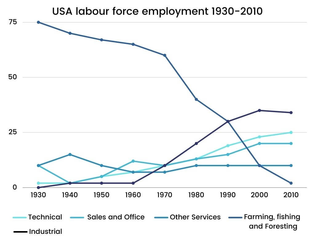
Overview: The given graph represents the patterns of employment in America between the time period of 1930 and 2010.
Paragraph 2: (1) Talk about the employment patterns in different sectors. Give figures.
Paragraph 3: (1) Talk about the employment patterns in different sectors. Give figures.
Paragraph 4: (1) Talk about the employment patterns in different sectors. Give figures.
Sample Answer
The given graph represents the patterns of employment in America between the time period of 1930 and 2010.
It is evident that in 1930, 75% of the American labour force got employment in farming, fishing and foresting. On the other hand, merely 10% were employed in sales and office and trade. During this time, the industrial and technical sectors comprised only 2% of the workforce. However, a gradual change can be seen in the situation over the next 20 years, except for the technical workforce as it employed threefold people.
Also, by the time 1980 entered, the American employment pattern had undergone a substantial change. While the number of employees in farming, fishing and foresting had declined to 40%, industrial and technical employees saw an upsurge to 13% and 10% respectively.
Likewise, the sales and office sectors didn’t increase until 1980. The most significant change can be seen in 2000 when the proportions of farming, fishing and foresting decreased to 1% while the other three significant sectors increased to more than 20% of the employment.
19 نظر
The given line graph illustrates information on the patterns of recruitment over a eighty-years period in the USA between 1930 and 2010. It is evident that the figures for industrial is highest over the period shown and the numbers for Farming, fishing and Foresting are lowest, also the most change took place in 2010. As can be seen, there was a sharply drop from 75% to 1% in Farming, fishing and Foresting between 1930 and 2010. on the contrary, the pattern of employment in Industrial experienced a drastically increase by 35% from 1930 to 2000, but the pattern of employment in Industrial remained without change from 2000 to 2010. Likewise, the sector of Technical had undergone a substantial changes and surged from 2% to 25% between 1930 and 2010. there was a marked difference in Sales and Office, which despite periodic fluctuations, it rose gradually from 10% to 15% throughout this eighty-years period, yet from 1930 to 1940, they wend down dramatically by 10%, also this trend took place again between 1960 and 1970 by 3% and they remained without changes between 2000 and 2010 and reached to 15%. Furthermore, the pattern of Other services surged gradually from 10% to 13% between 1930 to 1940, after that between 1940 and 1970 there was slowly decrease and it become steady from 1970 to 2010.
This graph shows the time plot of employment by sectors in America for 1930-2010. The considered sectors are technical, sales and office, other services, farming, fishing and foresting, and industrial. Except for farming, fishing and foresting, all other sectors represent an increasing trend over time. The employment trend of farming, fishing and foresting has steadily decreased till 1970 and has shrunk since then. Most of the US labor force was employed in farming, fishing, and foresting in 1930-1990, compared to other sectors. However, its share indicates a decreasing trend and, it has reached from 75 percent in 1930 to almost two percent in 2010. Employment in the industrial sector has shown an absolutely inverse trend. While it had the lowest share (0 percent) in 1930, approximately 30 percent of the US labor forces have been employed in this sector in 2010, which is the highest share. Besides, technical employment has raised briefly from near 0 percent in 1930 to twenty percent in 2010. As can be seen, the proportion of employment in other services sector does not show meaningful changes and has been steady at about 10 percent.
The presented multiline graph illustrates the trends of employment in diverse occupations in the USA. The changings indicate during 80 years. As is presented, it's clear that a significant downward trend has happened in the years given. On the contrary, the trend is upsurged for industrial and other mentioned vocations.
The given the line graph compares the patterns of employment in Usa between 1930 and 2010; including technical, sales and office, other services , farming , fishing and foresting, industrial. Generally speaking, industrial went up highest employment rate in 2010. The farming , fishing and foresting decreased substantially lower employment rate in 2010.
the given line graph here provides the pattern of employment in USA over the period of time 80 years.
Supplied line graph depicts the amount of USA labour force employment over the course of 80 years .
As you can see , the employment of labor in technical, industrial and sale and office work were constantly increasing and the most employment in these jobs is at the and of period , 2010 , while the employment in farming, fishing and foresting has decreased sharply and in the end of 2010 has the lowest employment rate among all occupations .
The supplied line graph depicts the comparison of trend of employment in the USA between the period of 1930 and 2010.
The supplied pattern represents the information on USA employment from 1930 up to 2010
supplied line graph figures the amount of labour force employment in USA between the period of time 1930 to 2010.
the presented line graph shows data on employment in America over the period of 80 years.
Generally speaking, all indexes represent an upwardv trend during a period of 80 years, except Farming,fishingvand Foresting that reduced dramatically. On the other hand, a tedious change can be seen in the technical index that after 80 years arriv3d on peak of its.
The line graph depicts the employment patterns in the USA between 1930 and 2010, a period of 80 years. The Farming, fishing and Foresting dropped over the period of time, whereas industrial, sales and office, technical and other services shows static increase. It can be seen in the graph that fishing, farming and foresting are the labour force with highest employment. On the other hand, industrial, sales and office, technical and other services appears to have similar patterns and shows stability.
The line graph illustrates the amount of employment in the USA between 1930 and 2010, a period of 80 years. Overall, it can be seen that farming, fishing and foresting are the highest in labour force employment, while industrial, sales and office, technical and other services show similar patterns and remained stable. In 1930, it is obvious that farming, fishing and foresting reveal an increase in labour force employment. This was higher than the other four labour force employment. In addition, it gradually decreased throughout 1940 and 2010, and finished at nearly 2%. Sales and office, technical and industrial increased gradually from 1980 to 2010. Other services can be seen that its peak in 1940 but remained stable from 1950 to 2010.
The given figure presents data on the employment patterns in the USA between 1930 and 2010, a period of 80 years. In general, it is clear that rates increase for the three service groups except Farming, fishing and Foresting dropped dramatically and other services steadied.
The given line graph presents information on the proportion of labor force employment in USA during eight decades. As is observed the figure for industrial, technical and sales and office show a upward trend, while farming, fishing and foresting declined suddenly and other services remained stable.
The provided line graph presents information on labor recruitment rate of the USA over 80 years (, figures are given in terms of percentage). In general it is clear that the all indexes has all three upward, downward and steadiness trends during a period of 80 years. It is evident that technical, industrial and sales and office had an upward trend during 80 years, except Farming, fishing and Foresting that reduced dramatically. On the other hand, other services have had a steady trend for 80 years and have not changed that much.
The provided line graph presents information on labor recruitment rate of the USA over 80 years (, figures are given in terms of percentage). In general it is clear that the all indexes has all three upward, downward and steadiness trends during a period of 80 years. It is evident that technical, industrial and sales and office had an upward trend during 80 years, except Farming, fishing and Foresting that reduced dramatically. On the other hand, other services have had a steady trend for 80 years and have not changed that much.
The supplied polyline graph provides the proportions for employment in different sectors in America from 1930 to 2010. Approximately all diagrams represent an increasing trend during these years, except for the farming, fishing and foresting sector, which decreased swiftly.
لطفا وارد شوید و نظر خود را ثبت نمایید.
بهترین ها
| نام | تعداد آزمون | میزان موفقیت | |
|---|---|---|---|
| َAmeneh Darvishzadeh | 1 | 100/00 % | |
| Mehrad Hashemi | 1 | 100/00 % | |
| مهدی حسین پور آقائی | 1 | 100/00 % | |
| Farnoush Toghiany | 21 | 98/36 % | |
| zahra namdari | 46 | 98/21 % | |
| یاسمن محمدی پور | 4 | 98/08 % | |
| Sheida Taheri | 3 | 97/37 % | |
| پژمان همدانی | 3 | 97/37 % | |
| محمدحسین میرزایی | 3 | 97/30 % | |
| Tara Mohammadi | 3 | 96/43 % | |
| yasaman mohamadipur | 51 | 95/86 % | |
| محمدجواد ملائی اردستانی | 3 | 94/44 % | |
| Arzhang Saberi | 4 | 93/33 % | |
| Soheila Karimi | 124 | 92/73 % | |
| aram farhmand | 10 | 92/31 % | |
| یاشار اسکندری | 98 | 91/14 % | |
| الشان مقیمی آذر | 11 | 90/80 % | |
| عباس پورمیدانی | 1 | 90/00 % | |
| پریسا سلوکی شهرضایی | 72 | 89/49 % | |
| ارشیا قلمکاری | 33 | 89/23 % |