محتوای الکترونیکی
Line Graph Sample

Write at least 150 words.
Report Plan
Paraphrase: presents>represents; employment patterns in the USA >patterns of employment in America
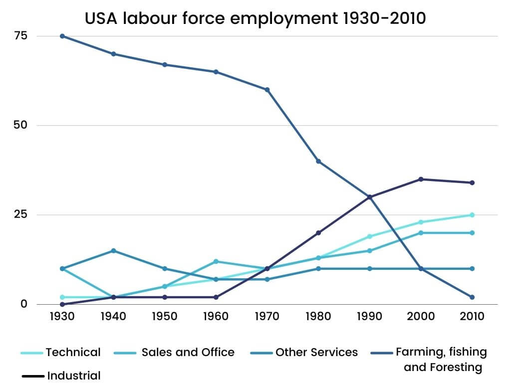
Overview: The given graph represents the patterns of employment in America between the time period of 1930 and 2010.
Paragraph 2: (1) Talk about the employment patterns in different sectors. Give figures.
Paragraph 3: (1) Talk about the employment patterns in different sectors. Give figures.
Paragraph 4: (1) Talk about the employment patterns in different sectors. Give figures.
Sample Answer
The given graph represents the patterns of employment in America between the time period of 1930 and 2010.
It is evident that in 1930, 75% of the American labour force got employment in farming, fishing and foresting. On the other hand, merely 10% were employed in sales and office and trade. During this time, the industrial and technical sectors comprised only 2% of the workforce. However, a gradual change can be seen in the situation over the next 20 years, except for the technical workforce as it employed threefold people.
Also, by the time 1980 entered, the American employment pattern had undergone a substantial change. While the number of employees in farming, fishing and foresting had declined to 40%, industrial and technical employees saw an upsurge to 13% and 10% respectively.
Likewise, the sales and office sectors didn’t increase until 1980. The most significant change can be seen in 2000 when the proportions of farming, fishing and foresting decreased to 1% while the other three significant sectors increased to more than 20% of the employment.
4 نظر
The given graph shows the pattern of empolyment in the USA during 1990-2010.
The supplied polyline graph provides the proportions for employment in different sectors in America from 1930 to 2010. Approximately all diagrams represent an increasing trend during these years, except for the farming, fishing and foresting sector, which decreased swiftly.
presented figure provides information on oscillations of USA utilization models in nineteens to early twenties .
The presented graph shows data on the percentage of Americans employed in different occupational groups during 1930-2010
لطفا وارد شوید و نظر خود را ثبت نمایید.
بهترین ها
| نام | تعداد آزمون | میزان موفقیت | |
|---|---|---|---|
| َAmeneh Darvishzadeh | 1 | 100/00 % | |
| Mehrad Hashemi | 1 | 100/00 % | |
| مهدی حسین پور آقائی | 1 | 100/00 % | |
| Farnoush Toghiany | 21 | 98/36 % | |
| zahra namdari | 46 | 98/21 % | |
| یاسمن محمدی پور | 4 | 98/08 % | |
| Sheida Taheri | 3 | 97/37 % | |
| پژمان همدانی | 3 | 97/37 % | |
| محمدحسین میرزایی | 3 | 97/30 % | |
| Tara Mohammadi | 3 | 96/43 % | |
| yasaman mohamadipur | 51 | 95/86 % | |
| محمدجواد ملائی اردستانی | 3 | 94/44 % | |
| Arzhang Saberi | 4 | 93/33 % | |
| Soheila Karimi | 124 | 92/73 % | |
| aram farhmand | 10 | 92/31 % | |
| یاشار اسکندری | 98 | 91/14 % | |
| الشان مقیمی آذر | 11 | 90/80 % | |
| عباس پورمیدانی | 1 | 90/00 % | |
| پریسا سلوکی شهرضایی | 72 | 89/49 % | |
| ارشیا قلمکاری | 33 | 89/23 % |