محتوای الکترونیکی
Line Graph Sample

Report Plan
Paraphrase: shows>illustrates; different sources >3 sources
Overview: The given graph represents the patterns of employment in America between the time period of 1930 and 2010.
Paragraph 2: (1) Talk about the employment patterns in different sectors Give figures.
Paragraph 3: (1) Talk about the employment patterns in different sectors Give figures.
Paragraph 4: (1) Talk about the employment patterns in different sectors Give figures.
Sample Answer
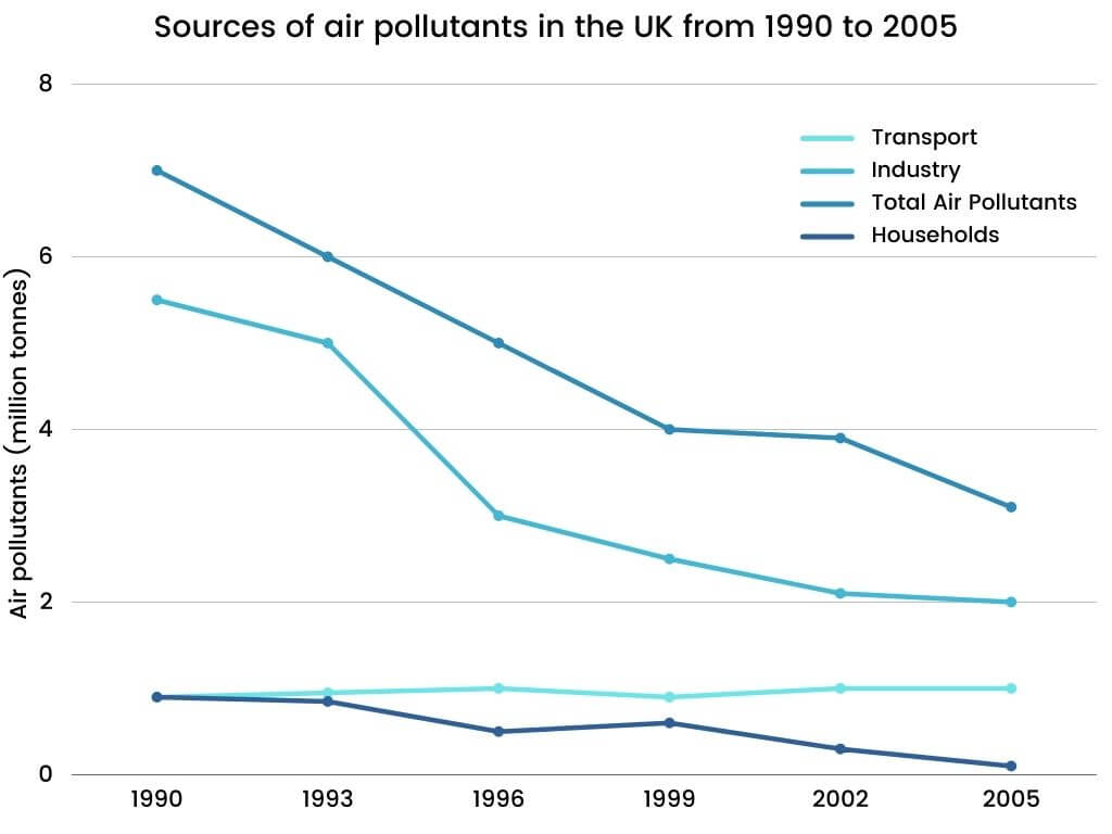
The line graph illustrates data on 3 sources of air pollutants in the UK during the period 1990 to 2005.
Overall, it is clear that the total amount of pollutants in the air has decreased over the years. The decline in air pollutants from industrial sources is predominantly substantial.
The total volume of air pollutants in the UK, in 1990, was nearly 7 million tonnes. This figure had a sharp decline to 4 million tonnes in 1999. After that, it continued experiencing a dip to just over 3 million tonnes towards the end of the said period.
5.5 million tonnes of air pollution was taken by the industry in 1990. And then, throughout the period, there was a decrease, and the figure reached up to 2 million tonnes by 2005, with a specific sharp decline between 1993 and 1996. On the contrary, the air pollutant’s amount was lower from the sources of transport and household. From transport, air pollution stayed almost constant at approximately 1 million tonnes from 1990 to 2005. On the other hand, pollutants from households decreased from nearly 1 million tonnes to almost 0.1 million tonnes in 2005.
19 نظر
The supplied line graph presents the amounts of air pollution sources including transport, industry, and households. Moreover, the trend for total air pollution is represented in the graph from 1990 till 2005. As is observed, the most effective source of total air pollution is relevant to the industry. In addition, by declining the amount of industrial pollution over the years, the total air pollution is significantly decreased.
The supplied line graph presents the amounts of air pollution sources including transport, industry, and households. Moreover, the trend for total air pollution is represented in the graph from 1990 till 2005. As is observed, the most effective source of total air pollution is relevant to the industry. In addition, by declining the amount of industrial pollution over the years, the total air pollution is significantly decreased.
The presented line graph gives information on data on 3 sources of air pollutants in the UK from 1990 to 2005, including , transport, industry, households. In common industry has decreased significantly lower air pollutants in the UK since 2005.
The provided line graph presents information on the origin of air pollutants in the UK in the period from 1990 to 2005 .
The presented line graph provided 3 sources of air contamination in the UK between the period of 1990 and 2005.
The presented graph shows the air pollution source differences for 15 years
the provided line graph depicts data on 3 source of air pollutants in the UK between 1990 to 2005.
the provided graph represents different reasons of pollutant in the UK during period time 1990-2005.
In general, the graphs show that total air pollutants, industry, and households moderately dropped from 1990 to 2005 in the UK but the transport graph stayed uniform.
In general, it is evident that, that amount of total pollutants in the air has declined swifty, also the fall of industry pollutants can be seen gradually. On the other hand, the Households and transport pollutants remained almost the same as it was 15 years ago.
The graph shows significant air pollution sources in the UK between 1990 and 2005.Overall, there has been a gradual decline over the years in the amount of air pollution annually with the only exception in the transport sector which shows a rise. In all, the amount of air pollution by the industrial sector is much higher than the other sources placed on the graph's x-axis. If the total is considered, we can also see an overall decrease in the total amount of pollutants, that is all sectors combined over the period of fifteen years.
Detail 1: Overall, the total number of air pollutants gradually declined over the period shown. Whereas the figures for industry and households decreased over the period and the figures for transport saw an increase. In 1990, a total of nearly 8 million tonnes of air contaminants were emitted from the three mentioned sources, with the largest figure belonging to industry, at 6 million tonnes. Detail 2: Of all the factors, Industry accounted for near to 5.5 million tonnes in 1990. However, this figure experienced a significant plunge, especially during 1993-1996 which it decreased by 2 million tonnes. In comparison, at 1 million tonnes, Households and Transport’s figures were 6 times less than the number of Industry at the beginning of the research. Household decreased substantially over time, at nearly 1 million tonnes over 15 years.
The line graph provides different sources of air pollutants in the UK from 1990 to 2005. As is presented, it is clear that sources of air pollutants reduce for the three groups involved in industry, total air pollutants, and households, except transport source steadied.
The supplied data compares sources that cause air pollutants such as transport, industry, total air pollutants and households in the Uk between 1990 and 2005. Generally the figure shows total air pollutants, industry and households decreased gradually While transport stayed constant.
The provided diagram shows data on different sources of air pollutants in the UK from 1990 to 2005. Overall, it is clear that the total amount of pollutants in the air has decreased over the years. The drop in air pollutants from industrial sources is mainly significant And also, over time, the amount of air pollutants in transport has been completely steady.
the presented line graph presents information about 3 sources of air pollutants in the UK over 1 decade.as is observed, it is clear that the total amount of pollutants in the air has been decreased over the years. the industry sharply declined over these years and the transport has leveled up during these years.
The chart gives information on the types of air pollutants in a time plot in the United Kingdom between the time period of 1990 and 2005. As is observed, in overall patterns, figures despite the fluctuations, had a reduction trend, except for the transport, which didn’t undergo a dramatic change. Likewise, it shows a static increase.
various provenances of air contaminants in the UK, waved progressively on the given chart for a 15-year period of time.
The provided figure presented the amount of polluted air in UK which started from 1990 until 15 years later and checked sources which are transport/industry and households
لطفا وارد شوید و نظر خود را ثبت نمایید.
بهترین ها
| نام | تعداد آزمون | میزان موفقیت | |
|---|---|---|---|
| َAmeneh Darvishzadeh | 1 | 100/00 % | |
| Mehrad Hashemi | 1 | 100/00 % | |
| مهدی حسین پور آقائی | 1 | 100/00 % | |
| Farnoush Toghiany | 21 | 98/36 % | |
| zahra namdari | 46 | 98/21 % | |
| یاسمن محمدی پور | 4 | 98/08 % | |
| Sheida Taheri | 3 | 97/37 % | |
| پژمان همدانی | 3 | 97/37 % | |
| محمدحسین میرزایی | 3 | 97/30 % | |
| Tara Mohammadi | 3 | 96/43 % | |
| yasaman mohamadipur | 51 | 95/86 % | |
| محمدجواد ملائی اردستانی | 3 | 94/44 % | |
| Arzhang Saberi | 4 | 93/33 % | |
| Soheila Karimi | 124 | 92/73 % | |
| aram farhmand | 10 | 92/31 % | |
| یاشار اسکندری | 98 | 91/14 % | |
| الشان مقیمی آذر | 11 | 90/80 % | |
| عباس پورمیدانی | 1 | 90/00 % | |
| پریسا سلوکی شهرضایی | 72 | 89/49 % | |
| ارشیا قلمکاری | 33 | 89/23 % |